
The web design industry constantly changes, some new web design trends will pop every now and then. Though it may not be necessary for you to know or incorporate these new trends into your web designs it can still help you generate and experiment ideas when designing your client website. You are able to come up with a fresh new idea that could become a new trend in web design.
And, knowing these current web design trends will be helpful as some of your clients might request one of these design trends to be incorporated into their website.
Trending Web Designs
Dark Mode UI
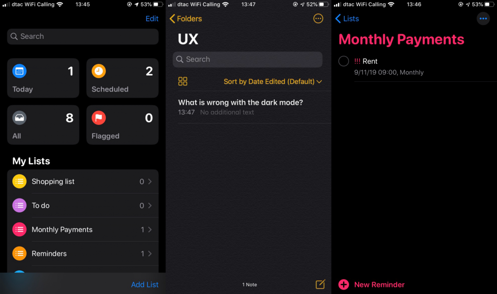
We saw the rise of dark themed UI some time around the end of 2019. Mobile UI is the main cause for the sudden rise of dark themed UI, with Apple first championing it with iOS12 and soon followed by social media giant Facebook, then Android jumped into the fray. Thus, voila! A surge of demands for website designs. Dark themed UI officially has become 2020 to-go-to website main color theme and UI design.
The dark color makes any website’s UI have an ultra modern look to it; sleek, futuristic, neat and avant-garde. Also, in comparison to any other bright colors—dark color is much more easy on the eyes. Especially now that most users often browse through websites during their 30 min – 1 hour of commute (average commute time for most). Besides that, it can easily make any design elements pop; widgets, etc. This is because dark colored background highlights and improves visibility of accent colors making the whole website design more dynamic.
Even better, dark themes are also the perfect partner in crime with another trending web design; the bright neon colors.
Cyberpunk And Futuristic Look Using Neon Design
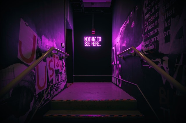
When someone says the ‘cyberpunk’ an image city filled with tall buildings infused with neon lights. And this concept has been incorporated into web design. Well, it is something completely new and groundbreaking, this cyberpunk concept for web design has been around for quite sometimes now. But only recently did it become prevalent and it is because now it has found it’s perfect pair; the dark theme.
Well, no you won’t get to see and experience tall buildings and neon lights on the website but it will create a surreal experience for viewers when they see it. Neon hues become more prominent with dark color, calling out and inviting viewers to click further. The combination of a dark background and bright neon hues gives a sense of exclusivity.
Taking Viewers On A Trip Using 3D Designs
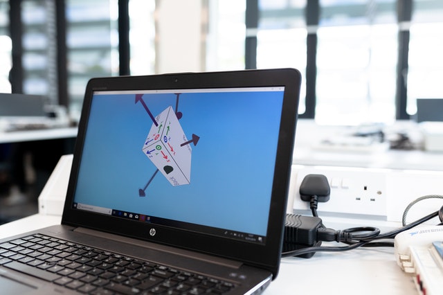
Aah~ 3D design elements, they have always fascinated and delighted us. And incorporating them into your web design will make the website immersive and interactive to the viewers. When a website is both immersive and interactive viewers often will longer as they will find the website interesting to explore.
Floating, Soft Shadows, and Layers: The Three Illusions
A website design wouldn’t be complete if it looks flat nowadays, but if the 3D effects are popping too much it won’t be good either. You have to find the balance in between no? This can be done by adding soft shadows to the 3D elements or non-3D elements. If soft shadows are added onto non-3D elements it will give the said elements pseudo 3D effects. While the floating effect will add a depth onto objects on the website.
Both soft shadows and floating effects will add more flair to otherwise flat designs that viewers will find bland.This is especially effective if you are designing for an ecommerce website or magazine website that features a lot of items.
Graphic And Photography
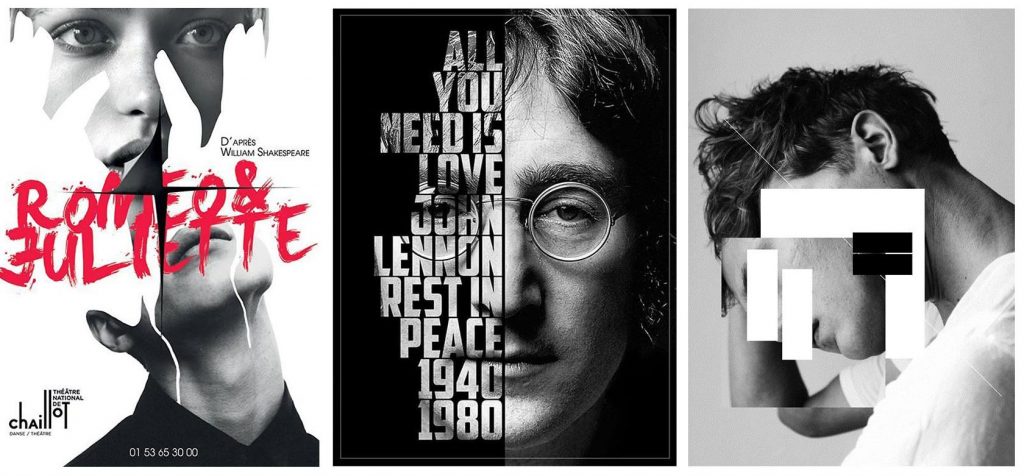
They are completely different yet still two sides of the same coin and this fact has been put into good use. This method for web designing is where you overlap a real graphic with a real photo, allowing you to experiment creatively and make the website look more fun. Instead of the usual drabby and bland website page. This collage like method is suitable to be applied on tech, fashion, or finance websites so that it will not only capture and show off the brand’s product or services but also looks fun and inviting for viewers.
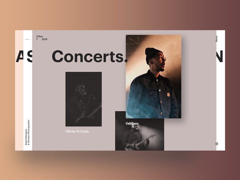
White Space Frame, Simple Yet Complicated At Times
Most websites use color bleed, and this web design style was famous until recent years. Web designers now lean towards utilization of white space as frame for sections on a website page to add more depth, structure and make an image pop even more.
Clever use of white space as a frame on a website will give the said website more dimension at certain sections. For example a section displaying a product’s image, using white space as a frame for that will make the product within the image stand out more. Including other elements such as the CTA (call to action) button that lead to the cart or product page.
Also, a good use of white space as a frame around the website will help organize and prioritize sections, making it easy for viewers to browse and navigate through the sections of the website.
There are a lot of web design ideas floating around waiting to be use as an inspiration by awesome web designers like you. You only need to explore the Internet (don’t go too deep though), and also on our website. Check out our blog page for web design ideas like these.
And if you are need of an awesome web design services, we also can help you with that. Check us out for more info.